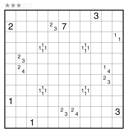
Tapa (Double) by Serkan Yürekli

or solve online (using our beta test of Penpa-Edit tools; use tab to shift between shading mode and the composite Yajilin mode where left click marks cells, right click marks dots in cells or X’s on edges, left click+drag draws lines.)
Theme: Faraday Cage
Author/Opus: This is the 321st puzzle from our managing editor Serkan Yürekli.
Rules: Standard Tapa rules. Additionally, shade two separate Tapa walls that do not overlap or cross each other. All digits in a clue cell refer to the shading of just one Tapa wall within the puzzle and provide no information on the shading of the other wall around that clue.
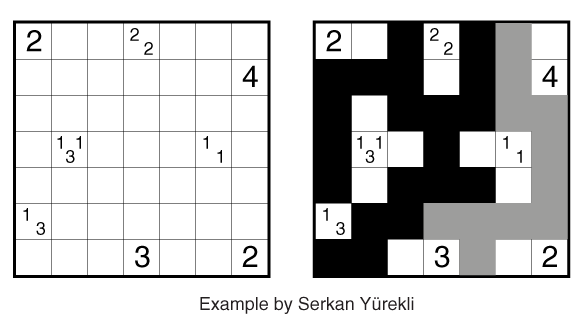
See also this example:

Difficulty: 3 stars
Time Standards (highlight to view): Grandmaster = 3:45, Master = 5:45, Expert = 11:30
Solution: PDF; a solution video is also available here.
Note: Follow this link for classic Tapa and this link for Tapa variations. If you are new to this puzzle type, here are our easiest Tapa puzzles to get started on. More Tapa puzzles can be found in The Art of Puzzles, in Tapa and Variations, and in our beginner-friendly collection Intro to GMPuzzles, all by Serkan Yürekli.

Really cool, taught me some new tricks for this variation 🙂
All I can say is…… Wow
Evil! Had to restart 3 times to arrive to the same sticking point until I realized what was going on.
What a genius puzzle. Guvf zhfg or gur chmmyr rdhvinyrag bs n funttl qbt fgbel – unf lbh frpbaq thrffvat rirel pyhr hagvy lbh trg gb gur raq naq svaq bhg vg’f nyzbfg n abezny gncn.
Exactly the same. I’ve been playing the puzzles here since the penpa experiment began in January. This week’s puzzles (and one from last week) are my first tapas, and this was of course my first exposure to this variant. It took me 45m and it was all down to not expecting “the trick” to this one. Evil, evil, evil.
Feature request for penpa: The tab feature is great for quickly switching between types of notation. It would be very convenient to also allow tabbing between options within a single type of notation (e.g. colors for shading, thickness for lines, etc.)
Very fun puzzle!
@ghirsch – Thank you for your feedback. I am glad you like the Tab feature. I have been thinking about that feature from quite a some time and haven’t come up with a good solution yet. Here is the issue, Adding all possible options within single modes means that adding like 100+ options into the tab dropdown which I personally feel may be too much and not practical. This combination increases factorially when there are options for both sub-modes and styles. One option indeed is to add only selective choices of them which are used more widely but then that “selective” varies from one person to person. I am open to ideas and suggestions.
On the side note, FYI: In the shading, any color you choose, you have secondary coloring option by default using your right click (green color).
One possible option is rather than have the tab dropdown use checkboxes for each mode, have them be dropdowns as well. But as you mention, that’s still difficult because for many modes there are multiple features that can vary.
Honestly I find the dropdown UI a bit of a pain already. An alternative that seems very natural is to add a button like “Add current notation mode to Tab list”.