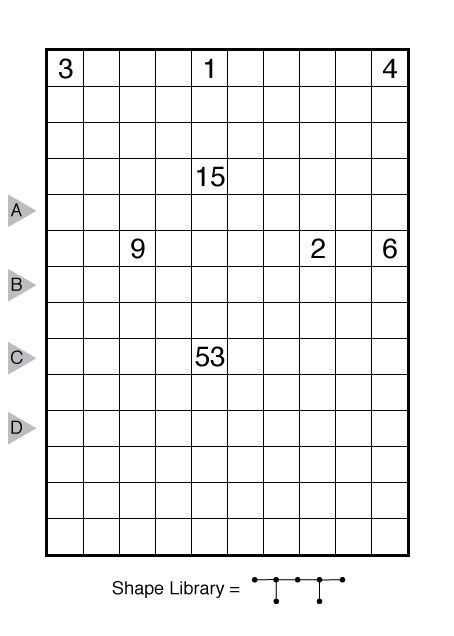
Surf by John Bulten
(Note: puzzles during this bonus week are harder than usual; the four puzzles from Monday-Thursday are all about Thursday or Friday level difficulty.)

or solve online (using our beta test of Penpa-Edit tools; use tab to shift between shading mode and the linex mode where left click+drag draws lines and right click marks X’s)
Theme: Pi
Author/Opus: This is the 41st puzzle from our contributing puzzlemaster John Bulten.
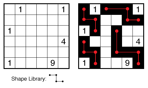
Rules: Shade some white cells black so that the grid is divided into white and black regions. Cells with numbers cannot be shaded. Each white region must contain exactly one number and have the same area in cells as that number. Two white or two black regions may only touch diagonally. Each black region must be exactly specified by one shape graph given below the grid, where graph edges represent one-cell-wide straight paths with variable lengths, and graph nodes represent ends, turns, and branch points. Graphs can be rotated and reflected, and, if multiple graphs are given, not all need be used.
Also see this example:

Answer String: Enter the length in cells of each of the black segments from left to right for the marked rows. Separate each row’s entry from the next with a comma.
Time Standards (highlight to view): Grandmaster = 3:45, Master = 6:00, Expert = 12:00
Solution: Answers for this week in this PDF.
Note: Surf is a shading/object placement puzzle created by Izak Bulten, which draws on elements from other shading puzzles like Nurikabe. We will have several more Surf puzzles from Izak and John Bulten in a few months when we start a new “Puzzlemasters’ Workshop” book series.

I look forward to more of these. I *thought* I was marking cells for valid reasons – but I was pretty darn happy to see the checkmark confirming that all was well.
Oh yeah this was a great puzzle. I feel that as you increase the number of shapes in the shape library though these types of puzzles will become a nightmare. This one with a single shape with a vast number of key points made a lot of logic appear easier.
I hate to be negative about puzzles, especially on this site. However, I didn’t enjoy this one at all, as for me it combines elements I dislike: the worst of Nurikabe (fiddly “I think this has to go here somewhere to take up a small space”-logic), and the curve-data-like shape placement logic that feels like wild guessing to me.
I know it’s hard to make a puzzle with this much amount of theming. In this case it felt like a clean logical solve was sacrificed for the clean execution of the theme.
I certainly hope that the next days will be more approachable.
I felt this puzzle had a very straight forward set of steps to solve. The start has a location that had only a single way it could ever work out, which lead to most the rest flowing well. The 2 main strategies I had to work with were figuring out how to proceed were finding the only possible way to fence off an area from other areas. As the shape rules were very constricting this led to a lot of discovery. The other was once I had a certain amount of the grid known, I used counting the remaining grid squares + the required to be white to determine the exact number of shaded cells left I needed which drove the constraints I had to accomplish the first strategy.