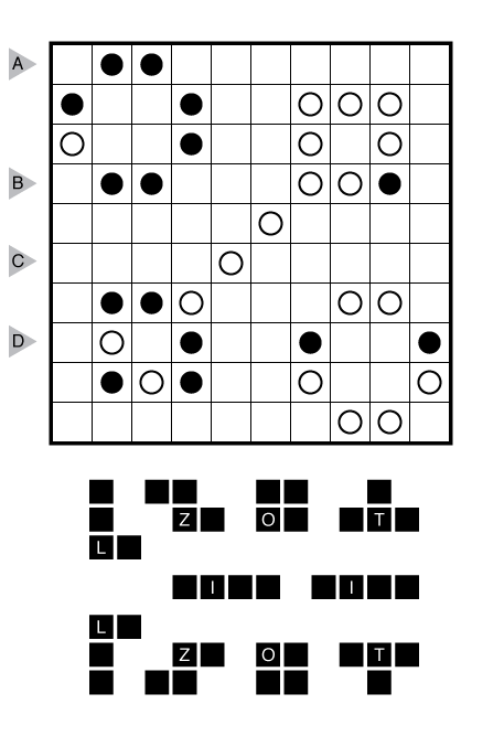
This is a Melon puzzle. (2 – Statue Park)

or solve online (using our beta test of Penpa-Edit tools)
Theme: % sign
Rules: Standard Statue Park rules. Note: despite the presentation of shapes above, all shapes can be reflected if necessary.
Answer String: Enter the length in cells of each of the shaded segments from left to right for the marked rows, starting at the top. Separate each row’s entry from the next with a comma.
Time Standards (highlight to view): Grandmaster = 3:15, Master = 4:15, Expert = 8:30
Solution: PDF
Note: Follow this link for other Statue Park Puzzles. If you are new to this puzzle type, here are our easiest Statue Parks to get started on.

I stared at this for almost 6 minutes and made pretty much zero progress. And then I realized, oh crap, the the white circles have to connect, don’t they?
So let’s be kind and subtract the time spent forgetting half the rules of the puzzle, and go with 5:30. Nice one.
Certainly! As described in the history of the type, the new bit of Statue Park that Palmer added that separates it from other pentomino/object placement was the connectivity rule of Nikoli types like Heyawake. Without it, there is really no way to progress to get one solution.
I’ve shied away from Statue Parks when seeing on them on Palmer’s blog, but this wasn’t that hard at all. Maybe I should go get that Statue Park pack after all…
You’re not alone. A lot of the feedback I get on this type suggests almost no one was comfortable with how to approach this type at first. I think many are still uneasy.
Maybe combining shape placement with this kind of connectivity was a more bizarre thing to do than I had imagined.
I certainly like this more than some other shape placement puzzles because of the connectivity rule.
One thing I did like about working through the entire packet back in the day was that there was quite a wide variety of logic and “feel” within the puzzle type. I suppose that also means that just one “approach” doesn’t necessarily work, but you definitely develop a general comfort level with the genre anyway.
I always find the presentation of Statue Parks to be a bit funny.
What if black circles become shaded cells, and white circles become small crosses?
That would be loads better for visualizing but would certainly kill the artistic appearance.
I agree; it seems odd to me to have me shading squares when the given squares are black circles, and dotting squares when the givens are white circles, but my experimenting with using white circles to mark the empty squares made it much harder to see what I was doing. I’d rather if the givens were closer to matching what a solver might use as their notation for cells that match the givens.
This is a pretty neat type, though, and seeing it here motivated me to finally do that statue park pack that I downloaded lo these many months ago, and I’m having lots of fun with the easier ones there at least! The hard ones still seem pretty frustrating to me, but I still like them a lot better than other genres of shape placement puzzles because the connectivity rule (and Palmer’s great designs) make for a more logical, step-by-step solve instead of a bunch of intuition or bifurcation.
I tend to use my typical Heyawake notation — fully shaded blacks, and then a web of lines for all the remaining white squares. There really isn’t any single graphical notation that would match my format but probably fully blackened cells for used and little dots for unused (which can grow into X’s or slashes or anything else the solver wants). Do you have other suggestions for presentation?
Your suggestion sounds good to me. Fully shaded blacks and little dots or + signs for unused cells would work fine.
Not my favorite Melon treats, but its just damn good to have Palmer churning out some puzzles again.
Thanks.
TheSubro
This variation did not feel weird at all.This puzzle here was quite smooth and nice.Thanks